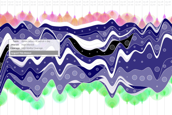
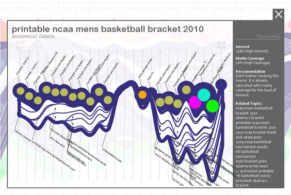
Current is a realtime data visualization showing a snapshot of what the internet-using population in America has been thinking for the last 24 hours, in the form of their collective search history. This information is condensed for readability into memes, living ‘thought organisms’ that act as though they have agency, control, and a selfish motivation.
News relies on soft stories like horoscopes, celebrity gossip and restaurant reviews to subsidize the important but less sensational stories that keep democracy running. At base, any solution to News’ present problems must address the balance between the hard news we need and the soft news that drives advertising dollars. By visually anthropomorphizing the capricious nature of public attention Current can spotlight these missed opportunities in news coverage.
The tools: the Google Top-20 hourly list of rising searches, Google News, Google Zeitgeist, Yahoo Keywords API, PHP, Processing. An early proof of concept was shown at the 2009 ITP Winter Show. The final version was shown at the ITP Spring Show. Website includes full academic explanatory paper. Current has been covered by NPR, PBS, and RWW, among others.
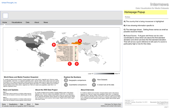
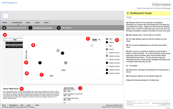
Two wireframes for a data visualization tool on the topic of media freedom throughout the world. The completed website includes multiple interactive data visualizations, data archiving, blogging abilities, and realtime data input. Custom CMS, Google Charts and Google Visualizations API, Ajax, Javascript, Microsoft SQL database. Project completed in conjunction with UrbanThought Inc.
Marketing Interface for Large NY-Based Newspaper
A wireframe for a marketing dashboard for a large NY-based newspaper. The concept links Google and Twitter's list of rising terms to which articles are advertised on the front page of the Newspaper's website, in realtime. This interface allows user to select between dynamically generated modules, keep track of their competitor's coverage, and identify news topics they might wish to cover. PHP, CSS, Javascript, SQL.
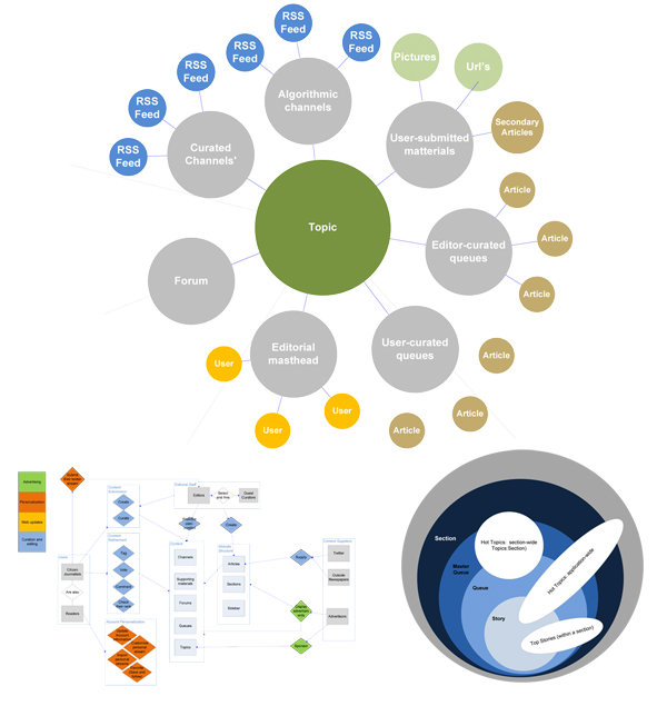
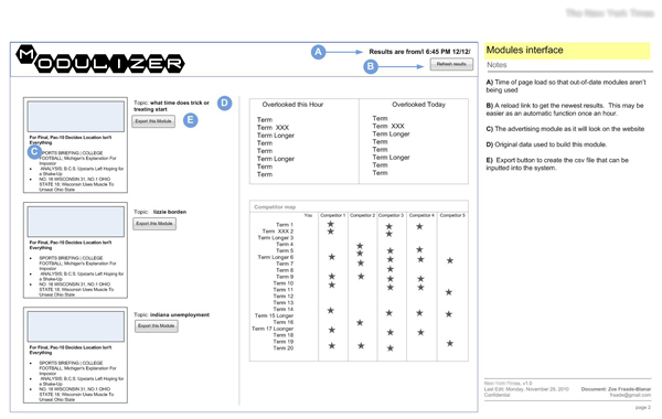
News-related Startup
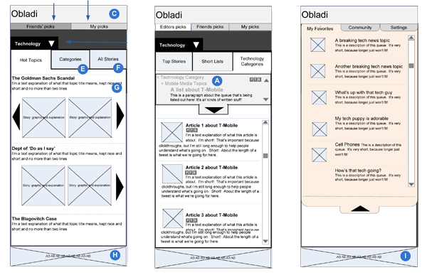
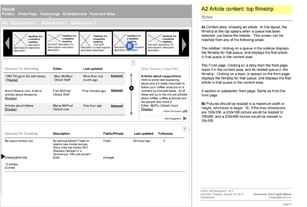
User workflow diagrams, functional workflow diagrams, content organization diagrams, and and wireframes for both mobile and web interfaces of a recent news delivery website. The tool is set up to
populate personalized news streams through human, algorithmic, and crowd-sourced curation.
Organizational diagrams
Wireframes for an early mobile application version of the tool
Wireframe for the website
Final, completed website (Look and feel are courtesy of outside designer)
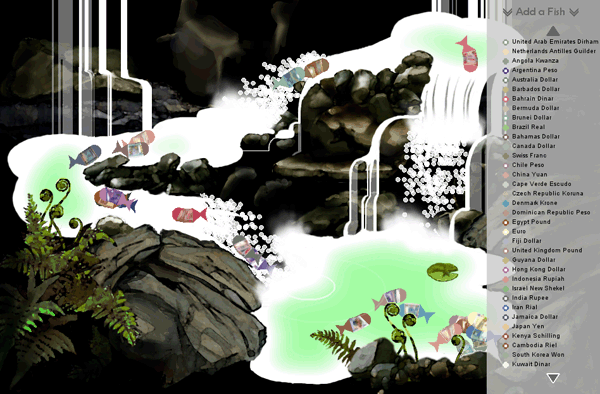
Scales: International Finance Interpreted as Fish . [Website]
Scales is a realtime data visualization that attempts to make international finance accessible by displaying these often dry numbers in fish form. Weak currencies are content to swim with the school in the pond, while stronger currencies race each other upstream. Users can add or remove fish throughout the simulation to see how they compare.
Technical notes:
The fish themselves are made of undulating sine waves. Their motion follows “flocking” rules with border-detection while in the pond, but uses “path following” algorithms while attempting to get upstream. The waterfalls are made from particle systems and the steam at the bottom of each waterfall is Perlin noise. The values for each fish are pulled from a financial rss feed that is updated every 6 hours. The interface is rendered in Processing (Java) using OpenGL. [Project Website]
Featured in the 2009 ITP Spring Show
Featured in the Reuters report 'Wacky inventions on view in New York'
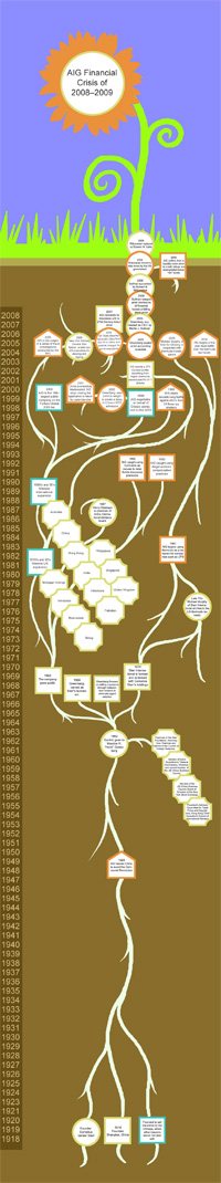
A data visualization of the separate subsidiary holdings, leaders, press releases, legal motions, suits, counter suits, stock prices, internal memos, PR materials, and historical events which collectively make up the story of the American International Group (AIG), now one of the most infamous corporations in the history of business. This visualization seeks to put some of the collective pieces of AIG's story in context. Interaction courtesy of Javascript.
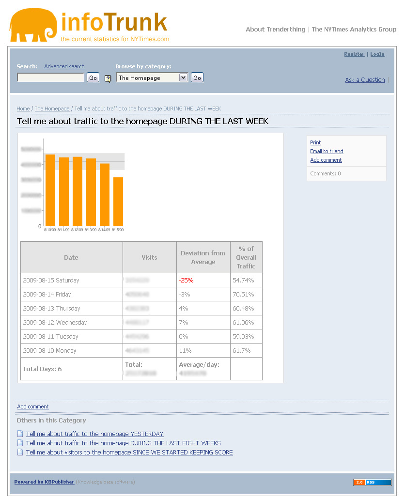
InfoTrunk
The InfoTrunk tool was created to provide realtime statistics and analysis on traffic patterns for the Analytics team and Customer Insight Group at NYTimes.com. The CMS used is Knowledebase, coding is in PHP using the Google Charts API.
Eye Music: A music visualization
This is a simple music visualization. Pure Data(PD) analyzes the music being played for attacks, the start of a new note. When it detects one it pulls the tone and volume for the specific instrument - in this case three different windchimes and some wind. It uses OSC to pass the data to Processing (Java), which generates an onomatopoeia readout for us to read, and also some pretty lights for us to look at.
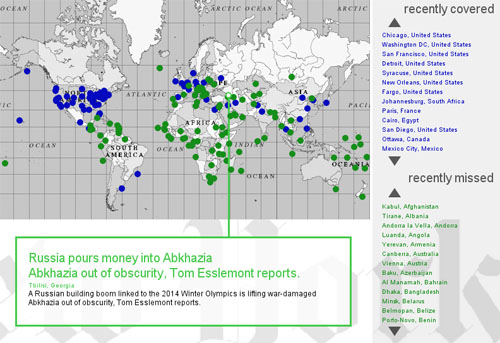
A reatime data visualization based on the writings of Ethan Zuckerman. The world is becoming more insular as news sources focus more tightly on a few small areas while missing the news in others. The Overlooked News-Reader uses the New York Times to chart out what news articles are being reported right now, and locates articles from countries the New York Times has chosen to overlook. Application uses Processing, PHP, and SQL.
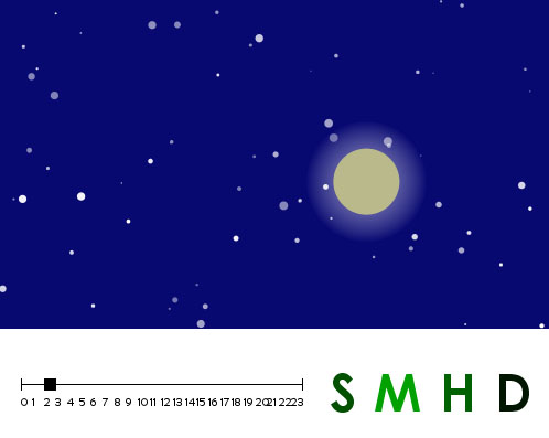
A clock for the visually inclined, the letters at the right change color from black to green as they count out the milliseconds, seconds, minutes, and hours that make up a day. The display area reads out a bunch of visual feedback to give the position of the sun or moon, lightness of sky, number of stars. Feeling Impatient? Use the slider at the bottom to see what the world will look like at some other time. Applet uses Processing. [Active Clock
Site]
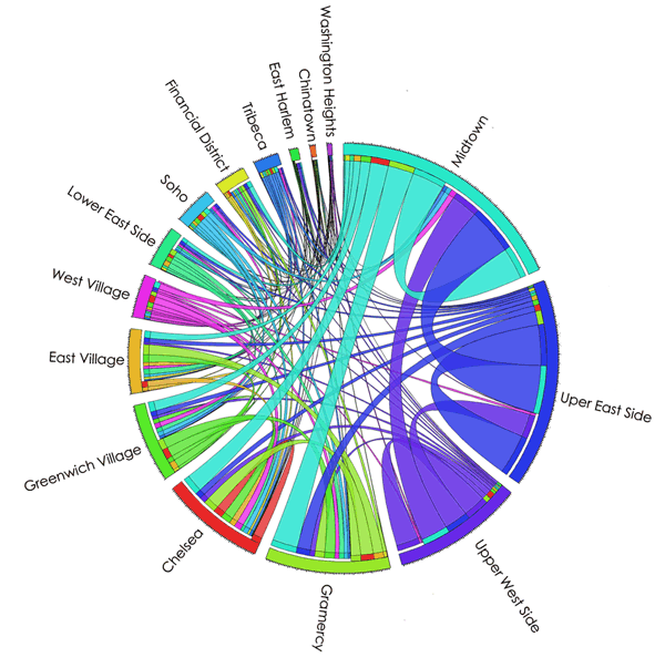
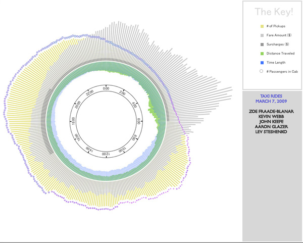
A data visualization showing a week of taxi service in Manhattan, completed as part of the 2010 Hacks/Hackers Hackathon. Data crunching was completed in Python by a fellow team member. Visualization uses Processing.
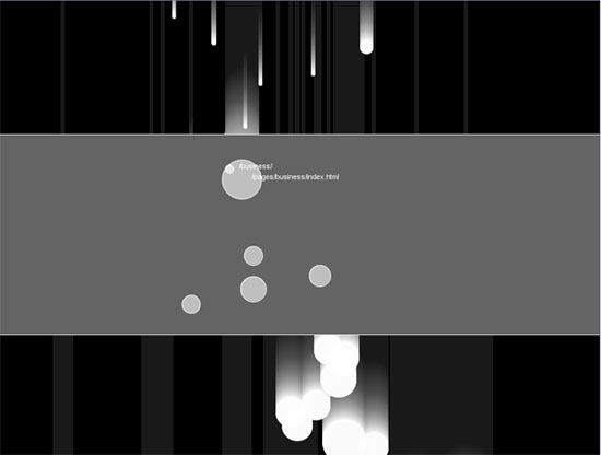
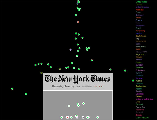
These screenshots are taken from animated visualizations created for the New York Times Analytics Department to help understand movement of traffic throughout the NYTimes.com website. The first shows entry pages vs. time spent on the site, the second shows bounce rate (traffic that arrives at a site and immediately leaves) by country.
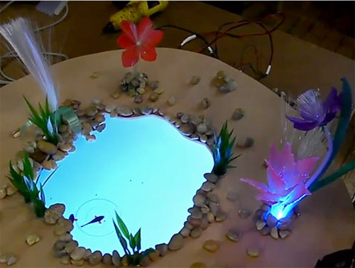
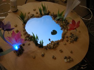
A virtual aquatic environment including hungry fishes, a physical way to feed them, and stress sensors for participants. The feeder includes an accelerometer that can track its position and 'shaking' behavior. The water is an LCD screen. Fiber optic grass reflects the fish's hunger level. Galvanic Skin Response Sensors on wrist bands track when users are stressed, and sends the fish to 'comfort' whoever is having the worse day. Project uses an Arduino chip and Processing.
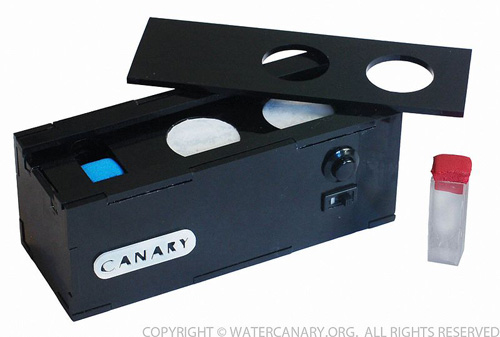
The Water Canary is a low-cost, instantaneous water testing device that reduces the time and funds needed to respond to disasters effectively. The Water Canary was created in conjunction with UNICEF and was a winner in the Stern Business Competition Social Venture Competition.
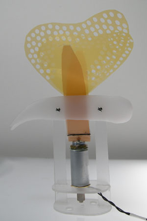
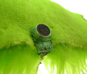
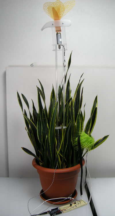
A natural, visual interface for a singer to express themselves during a performance. Input is received through a small microphone embedded in a necklace that rests against the voicebox. Butterfly wings are driven by a single push-solenoid, controlled by an Arduino chip.
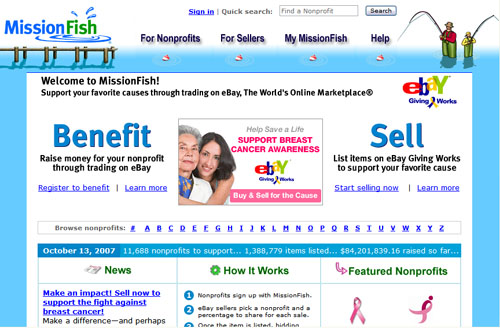
MissionFish is eBay's GivingWorks tool allowing sellers
to donate a percentage of their sale to nonprofits. Interaction design, graphic design, wireframes and front-end
coding. All illustration by a private illustrator. Custom CMS. [Link]
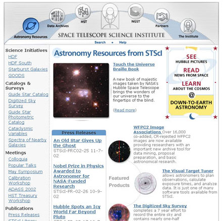
The front door website of the Space Telescope Science Institute,
running the Hubble Space Telescope and the future James
Webb Telescope. Collaborated with the design
and web teams to create the site look and feel and front-end
code. Usability and accessibility testing. The
CMS used was ZOPE. [Link]
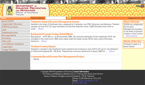
Thailand Ministry of the Interior
Site design for this English language website was completed
pro bono for the Thailand Department of Disaster
Prevention and Mitigation after the December 2004 Tsunami.
Site design, look and feel, coding, scripting,
and implementation. Local department staff handled content
translation and formatting.
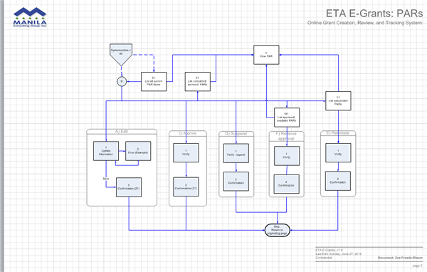
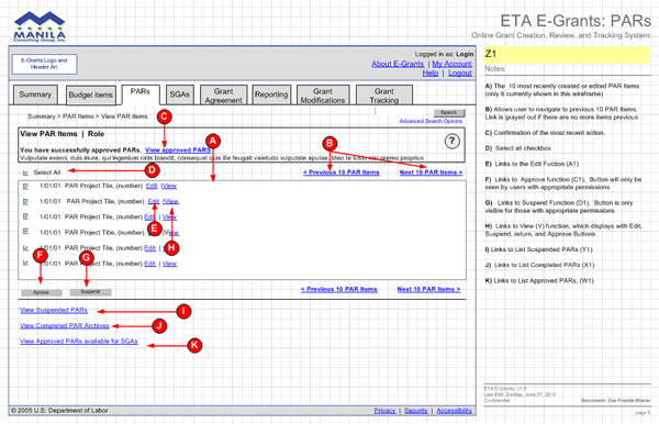
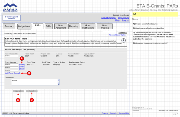
United States Department of Labor
The Egrants.gov system at the US Department of Labor,
this software handles the grant lifecycle for all outgoing
finances. Created User workflows, wireframe documents, and
prototypes. The CMS used was Oracle and BizFlow.
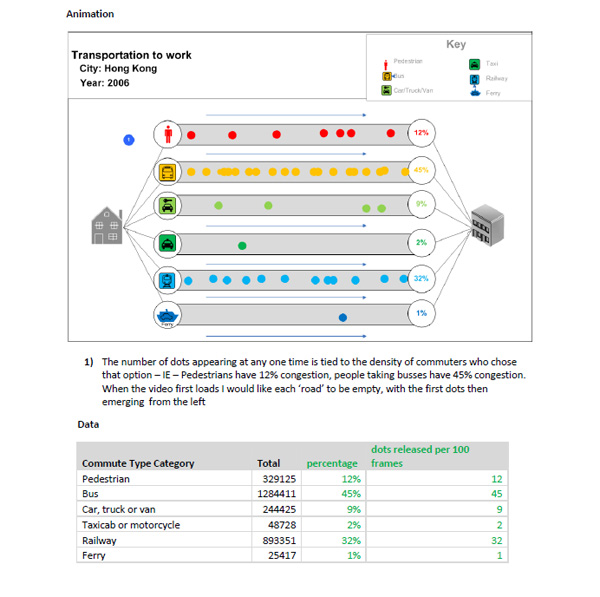
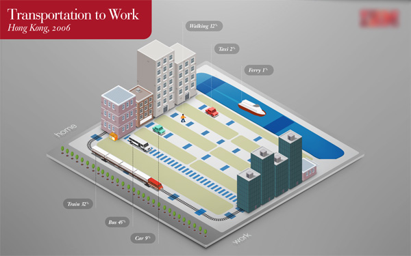
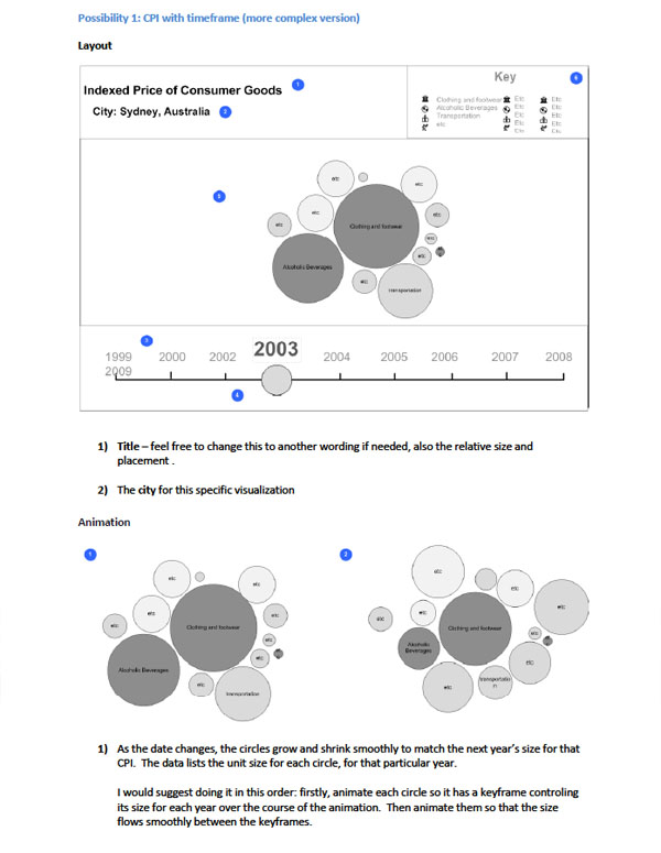
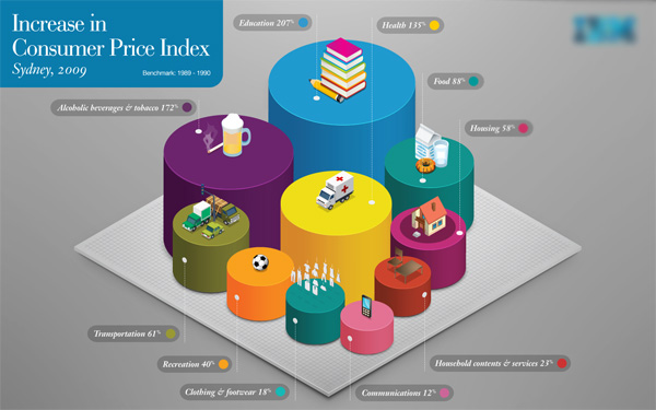
Data visualization for an urban infrastructure conference
Two examples of Interaction Design from a set of four data visualization applications created for an advertising agency client. Separate versions were created for an interactive, online version, and a static version for rotating monitor display. The final post-production version as interpreted by the teams's graphic designer is included after each.
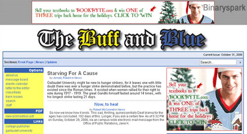
Gallaudet Student Newspaper
Website for The Buff and Blue, the official student
newspaper for Gallaudet University.
Site design and implementation. Site structure is tableless in order to be
more accessible for people with disabilities. The CMS used
is College Publisher
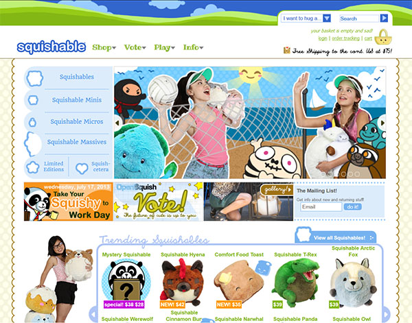
Squishable is the small business that got...bigger. An ecommerce site began as a hobby in 2006, it now boasts separate mobile, web, wholesale and international, sites, multiple web aps, a vibrant crowdsourcing community who collaborate on designs, and almost a million fans on Facebook. The CMS used is Miva Merchant. Site is COPPA compliant due to the nature of its material. [Link]
An ecommerce website selling psychology-related textbooks. Back-end scripting was done in collaboration with UrbanThought. The CMS used was MonsterCommerce.
[Link]
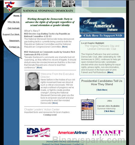
National Stonewall Democrats
The web site for the National Stonewall Democrats, a nonprofit group working for the nomination of Democratic candidates to government positions.
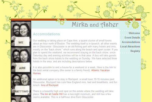
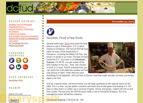
An online magazine about food in the DC area. Design, implementation, testing, and light content editing. The CMS used was Movable Type.
[Link]
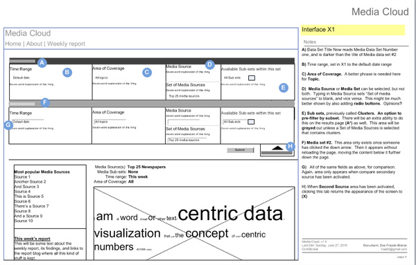
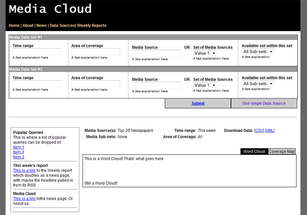
Media Cloud
Interaction design from the forthcoming project by Ethan Zuckerman's team at Berkman. From the website: Media Cloud is a system that lets you see the flow of the media. The Internet is fundamentally altering the way that news is produced and distributed, but there are few comprehensive approaches to understanding the nature of these changes. Tool design is now in its final stages.
Wireframe mockup
Javascript/CSS/HTML implementation without any look-and-feel treatment. All code is tableless.